

Brandon Carroll
Measurement is an essential part of our practice. Data is power, and one of the most powerful tools we have available for gathering that data is Google Analytics. Google Analytics is by no means a new tool—but for a tool that so many people know about, many of its features remain a mystery. Let’s talk about three of the lesser-known Google Analytics features that will change your reporting process.
Content Groupings
Whether you’re managing an ecommerce website, an online brochure or informative website, or something more content-driven, such as a blog, one of the most important things we want to know is what content is performing and what isn’t. Let’s use NATIONAL’s website as an example.
NATIONAL’s website usually has between five and twenty perspective posts in any given month. If we wanted to see what the top perspective post last year was, we can do that pretty easily using the default Google Analytics reports. But what if we wanted to know what kind of posts performed best? Maybe we want to know how our posts about a particular topic perform, such as energy or government relations, so that we can ask our authors to write more of those kinds of posts.
To do this, we’d normally have to figure out what all of the blog posts about energy were, then use custom filtering to pull out a report showing only those posts. Depending on how many posts we’re talking about, this could be really time consuming. There’s a better way!
Content Grouping allows us to define criteria that Google Analytics can use to categorize pages on a website. So, for NATIONAL’s blog, we can create a content grouping called Themes, which contains groups such asEnergy, Government Relations, Advocacy, Marketing Technology, Healthcare, and Content Marketing.
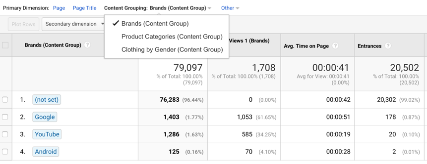 Google’s Merchandise Store has Content Groupings for Brands, Product Categories, and Clothing By Gender. The Brands Content Group contains the groups Google, YouTube, and Android
Doing this allows us to more easily see which content topic performs the best. This is just one way to use Content Groupings on the NATIONAL website. We can also create groupings for article length, author, and more.
To learn how to set up Content Groupings in Google Analytics, read more about it from Google, or check out this great video from Loves Data.
Cohort Analysis
The Cohort Analysis report is one of the newer reports available in Google Analytics.
We know that a cohort is a group of people, so a cohort of web users could be a group of users who completed a desired action within a certain time period, or who arrived on the website for the first time on the same date.
The Cohort Analysis report is fairly new, so there’s only one type of cohort we can look at, Acquisition Date, which is still a very useful metric. Let’s say we are Google and we had an awareness campaign running for our website over December of 2017, using a different strategy to drive users to the website each week. How can we tell which strategy worked best to drive users who would keep coming back? Enter the Cohort Analysis.
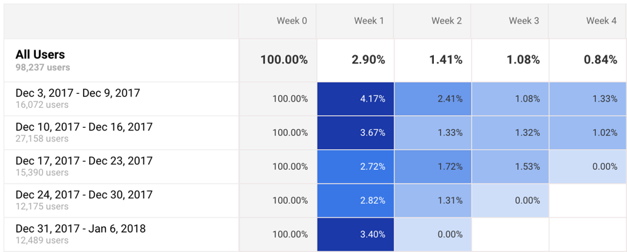
The above screenshot is taken from Google’s Demo Analytics Account, but let’s just use it as an example. The rows represent each week that our campaign ran, starting from December 3rd down to January 6th. The columns represent the percentage of users that were retained, or who revisited the website each week after. So, for example, in the row for Dec 17th–Dec 23r, 2017, we saw 15,390 users visit the site. Week 0 represents that week, so of course the retention rate is going to be 100%. Week 1 represents the following week (Dec 24th–Dec 30th), Week 2 the week following that, and so on.
So, how can this be useful? If this were our campaign data, we could easily see that the strategy from Dec 10th–Dec 16th drove way more users, but the strategies used in the weeks before and after that had better retention rates. We can use that information to guide us in future campaigns.
Retention rate is just one of the things we can measure with Cohort Analyses. For more information on using this feature, check out Justin Cutroni’s article on the subject.
UTM Tagging
UTM Tagging is one of the ways that we can control how Google Analytics interprets the traffic that’s coming in to a website from an outside source. They look like this:
http://www.national.ca/?utm_source=facebook&utm_medium=social&utm_content=carousel_ad
Whether it’s a Facebook ad, a display ad, a link to our site from a social account, or even a print ad, every inbound link to our websites that we can control should be tagged!
Let’s imagine a scenario where we’re running a Facebook campaign pointing to this article, in which we’re using several different ad types. If we don’t tag the ads properly, we’ll be able to see a spike in traffic but we won’t really know where that traffic is coming from beyond the channel level. We would have no way to tell between a successful ad campaign, an influential share, or some other measure that can be attributed to success. Not really helpful for trying to build and repeat on our success!
The good news is that this is the easiest problem to correct. Google even has a helpful URL builder tool so we can easily generate the links to use in all of our ads and posts.
If you want to learn more about UTM tagging, have a look at this awesome article from Funnel.
If you want to learn more about other ways you can better utilize your Google Analytics data, reach out to our Marketing Technology experts.
——— Brandon Carroll is a former Marketing Technology Analyst at NATIONAL Public Relations

