

I love network graphs.
I’m also the kind of person who says things like “I love network graphs” without irony. Take from that what you will.
Before I get to why I think they’re great, some basics. What’s a network graph? In muddled layman’s terms:
Network graphs are an output of graph theory, which is “the study of mathematical structures used to model relationships between objects.” To put it another way, this is the practice of showing the connectedness of things: How close in proximity they are (geographically or ideologically), how influential compared to peers, and how tight bonds are between connections. There is so much we can learn about ourselves through this kind of work. Ever wonder how ideas can spread through groups, or what kind of structure yields the most effective team? Try graph theory for the answers.
Even more exciting, we are just nibbling at the golden age of network graphing because—as I’ve written about before—we’ve never had so much stuff in the world that is demonstrably and measurably connected to each other, nor the tools to understand these connections. Thank you internet, IoT, phones, social media, email, and every other digital thing that talks to other digital things.
Seeing the patterns of these networks reveal a lot about us as a society and how we interact.
- They reveal hidden truths and patterns, like the intellectual property stances of Apple vs. Google, the history of music, notable relationships in the Middle East, or the human interactions surrounding a complex healthcare company on any given day.
- They help us understand stories, art, and culture—from Game of Thrones to Shakespeare
- Network graphs and analysis can help us interpret peer relationships, like what influences our happiness and how we influence (or don’t influence) each other.
We create network graphs for clients in order to understand the patterns, connectedness, and natural clustering of stakeholders. As an experiment, we took a look at the recent provincial election in Nova Scotia and the social conversation.
The Nova Scotia Election: isualized on Twitter
We looked at the Twitter conversation surrounding the Nova Scotia election over 30 days, resulting in an analysis of over 85,000 tweets. This isn’t exactly big data, but it’s a lot to look at. In all its glory:
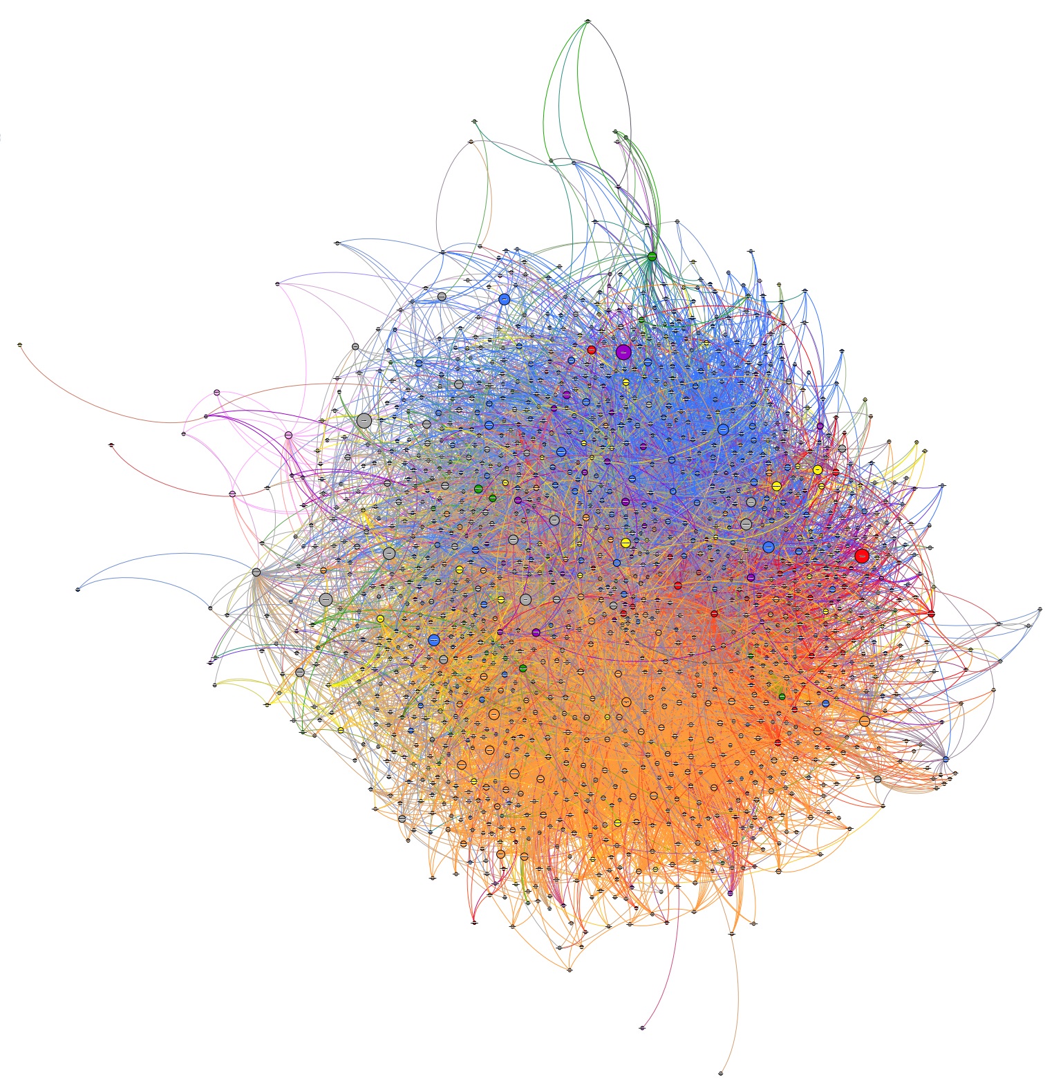
To grab a full PDF version of the network graph that’s more fun to play with and can be zoomed in on, visit here.
What exactly are you looking at?
- The circles (much more visible in the PDF) are Twitter handles. The larger the circle (or node), the more influential the handle is within the conversation. The lines connecting the handles represent followership.
- Orange represents the cluster that most referenced left or labour-related words, the NDP party platform, or NDP candidates. There is a significant distinction here to underline when looking at this graph: Orange does not mean “NDP supporter”. It means heavier use of words associated with the left or the NDP election platform. Those in the orange cluster could be supportive…or they could just be active in the conversation using this particular cluster of words.
- Blue indicates words used related to the Progressive Conservative platform and candidates.
- Red shows a cluster representing words associated with the Liberal Party platform and candidates, but it is worth noting that “Stephen McNeil”, the Liberal Party leader, was a dominant topic across all conversation clusters (orange, blue, and otherwise).
- Grey, woven throughout, mostly represents the news media outlets and news personalities.
- Yellow is “get out the vote” talk, coming from multiple voices focused on voter education.
- Purple represents activity surrounding both provincial debates.
- Green stems from ecology, environment, and Green Party mentions.
What can we take from this?
- Filed under a great observation of the obvious—but nonetheless nice to see visually—the incumbent government was in every part of the conversation. They were the target and running for re-election, and thus a part of every cluster. This, we think, is a healthy looking map for a potential winning candidate: The Liberal leader, right in the middle of the map, has high connectivity to both the northern (right-leaning) and southern (left-leaning) aspects of the conversation.
- We took this same snapshot halfway through the election cycle, and the orange colour—labour, left-leaning conversation cluster—grew substantially. There was a surge in this conversation cluster in the second half of the campaign.
- Again, if you explore the PDF, the colours aren’t perfectly aligning to what you might think (e.g. some media outlets seem to be closer to the left or right). An algorithm made these clusters, but it requires human investigation to dig deeper. If a news outlet or journalist appears as a “political” colour, are they especially active, supportive, or critical? The algorithm doesn’t account for sentiment or orientation. Humans need to make this judgement and interpretation.
- The larger the circle, the greater the influence—by Twitter standards. In this case, influence is weighted by number of connections, retweets, and interactions.
- In a more practical sense: Say we wanted to extract every non-media outlet that was included in a particular colour. We could dive deeper into those personas, understand their interests and needs, and potentially target them with particular language, imagery, and marketing technology. In fact, this is exactly how we use maps like this in communications planning.
There’s a lot here, and it is important to remember the limitations. While math underpins the clusters in the graph, humans have all the context, and way more input than one equation and a singular data set.
It’s also tempting to want to apply network graphing to all challenges—how does our audience connect? How might an idea move through our stakeholder database by mapping these connections? Good questions, but it’s important to remember: If there isn’t data to connect, there isn’t a network graph (social or otherwise) to create. Having data, however messy it might be at the start, is a prerequisite. With social networks it’s a little easier because, by definition, the social data points have connections.
Network analysis is part of what we do every day, and we think it’s only going to grow and become a more sophisticated and integral piece strategic planning. Ultimately, this is another fantastic tool in the journey to understand context, meaningful connections, patterns, influence, and insights.
What’s not to love?
Reading List:
- An Introduction to Social Network Analysis
- Mapping Shakespeare’s Tragedies
- How Ideas Spread: TedX Sydney
- Social Networks and Happiness
- Using Data Visualization to Find Insights
- Information is Beautiful: Distilling the world’s data, information and knowledge into beautiful and useful graphics & diagrams
- Flowing Data: How statisticians, designers, data scientists, and others use analysis, visualization, and exploration to understand data and ourselves
- A great primer with basic math: MIT Open Courseware, Graph Theory and Coloring
